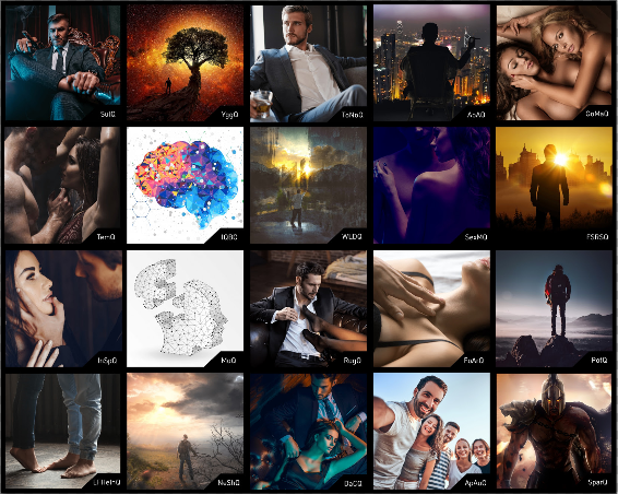
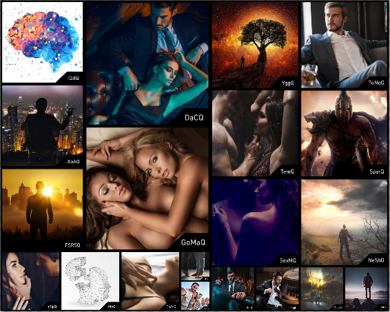
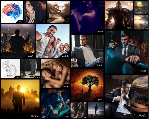
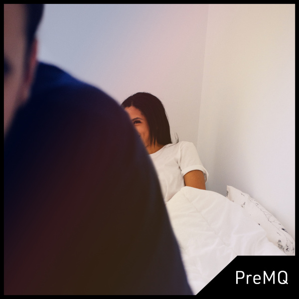
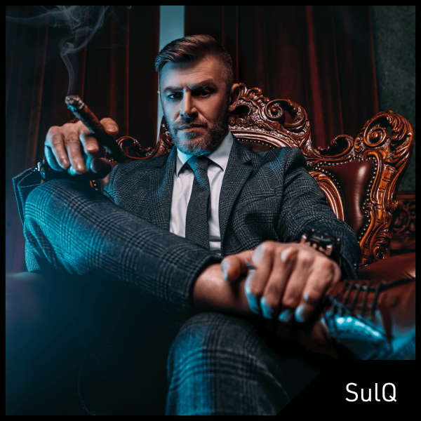
I really like the artwork on the customs. Like really like. The titles, the images, the formatting, the whole deal. It’s ridiculous. I even like the abbreviation codes (‘YggQ’).
I don’t know who is behind the design process, but I seem to like Every Single Thing they come up with.
So props to you whoever you are.
I’ve liked Yggdrasil ever since @SaintSovereign first teased it in the forum ahead of the big Q Store opening.
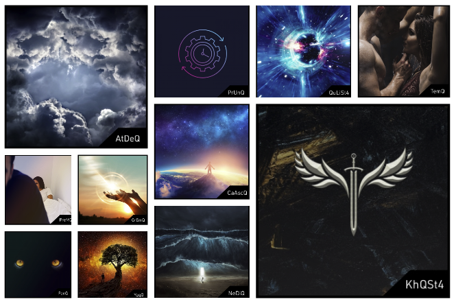
One of my current favorites is the artwork of Wealth Limit Destroyer. It’s so good.
DEUS is another one I love.
And another cool aspect is that the style of the artwork often gives you a sense of the module’s focus and how it works. It’s not arbitrary.
Some of them have a kind of round, circular feel. Others have sharp lines and acute angles. None of it feels arbitrary.
The Architect really evokes the feel of building up energetic architecture and internal structures.
Okay, at this point, I’m sensing I could just keep describing each one.
They’re really good. I can’t choose a favorite.
It adds to the good feeling of working with the product. I’ve always appreciated the artwork of the Subliminal Club products, but I think the Q Store took it to another level. There’s so much more of it, and also for the major programs, the art was generally working within the constraints of a kind of Black Box framing presentation. For the modules, each image stands independently.
And yes, this was the entire point of this post.

 ) that includes the images of all the modules involved!

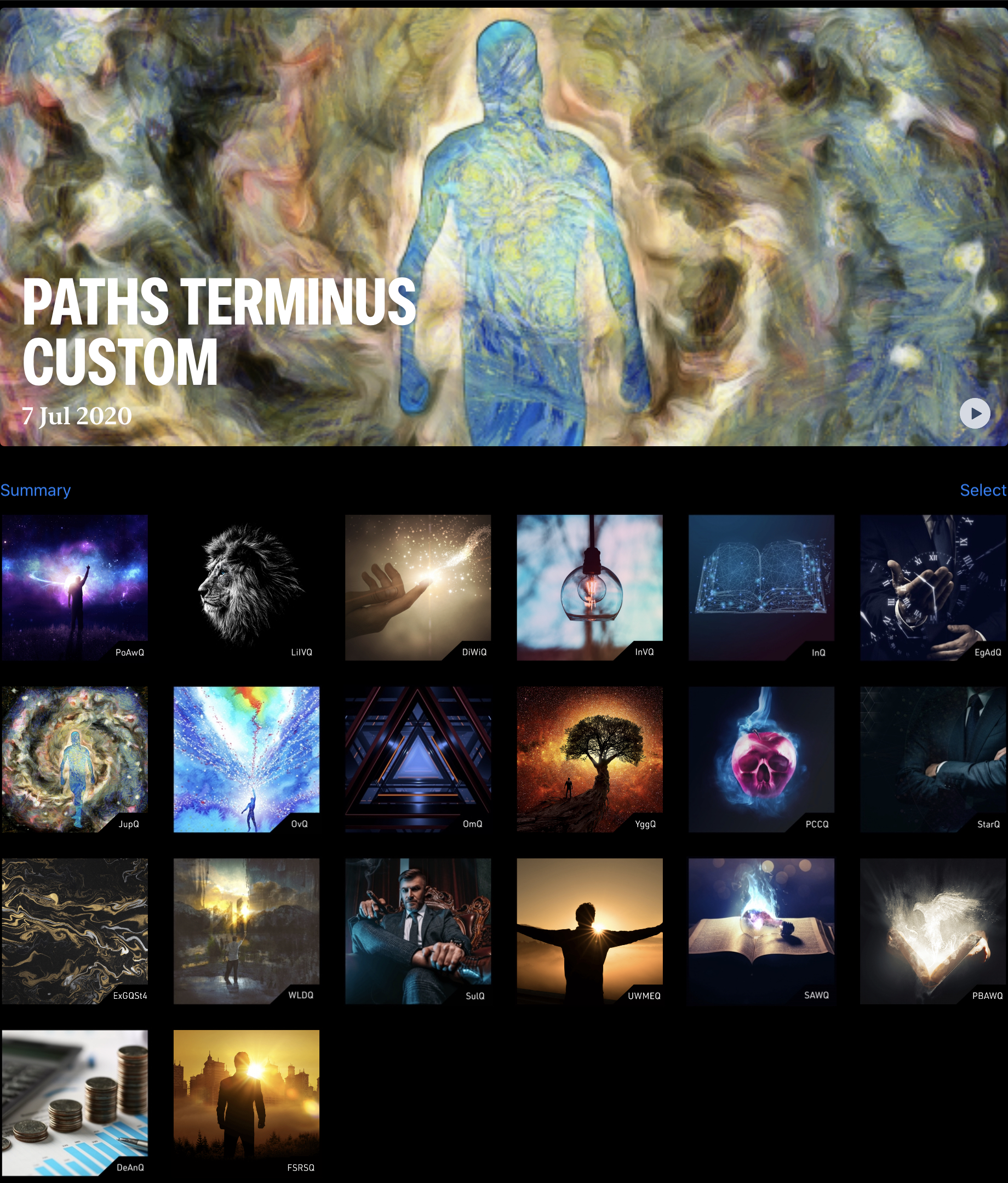

 Not a stack or custom, just pics I like. Same 20 images, in different layouts.